Client: Arkov
About the project
Arkov
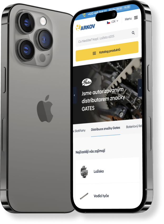
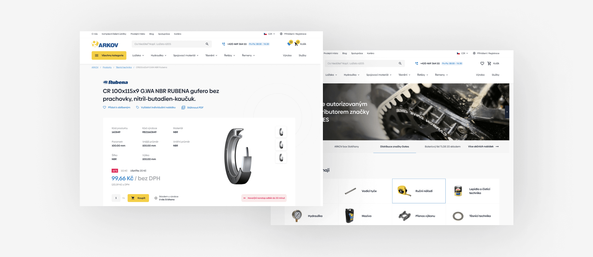
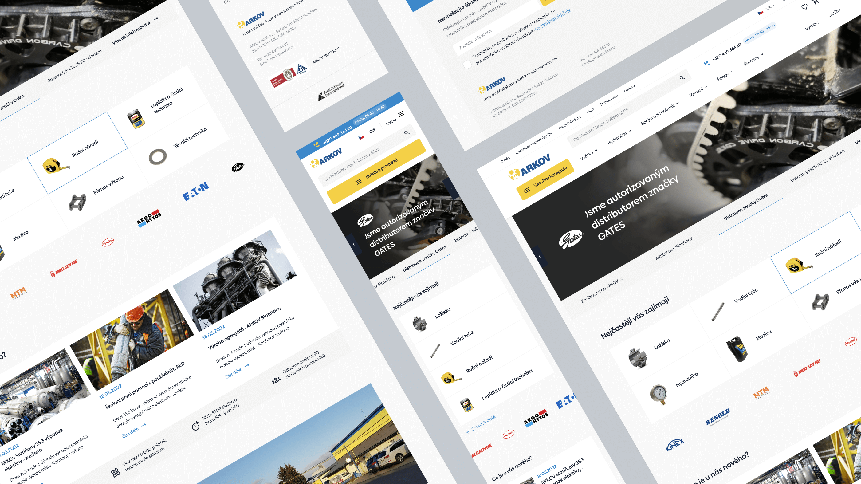
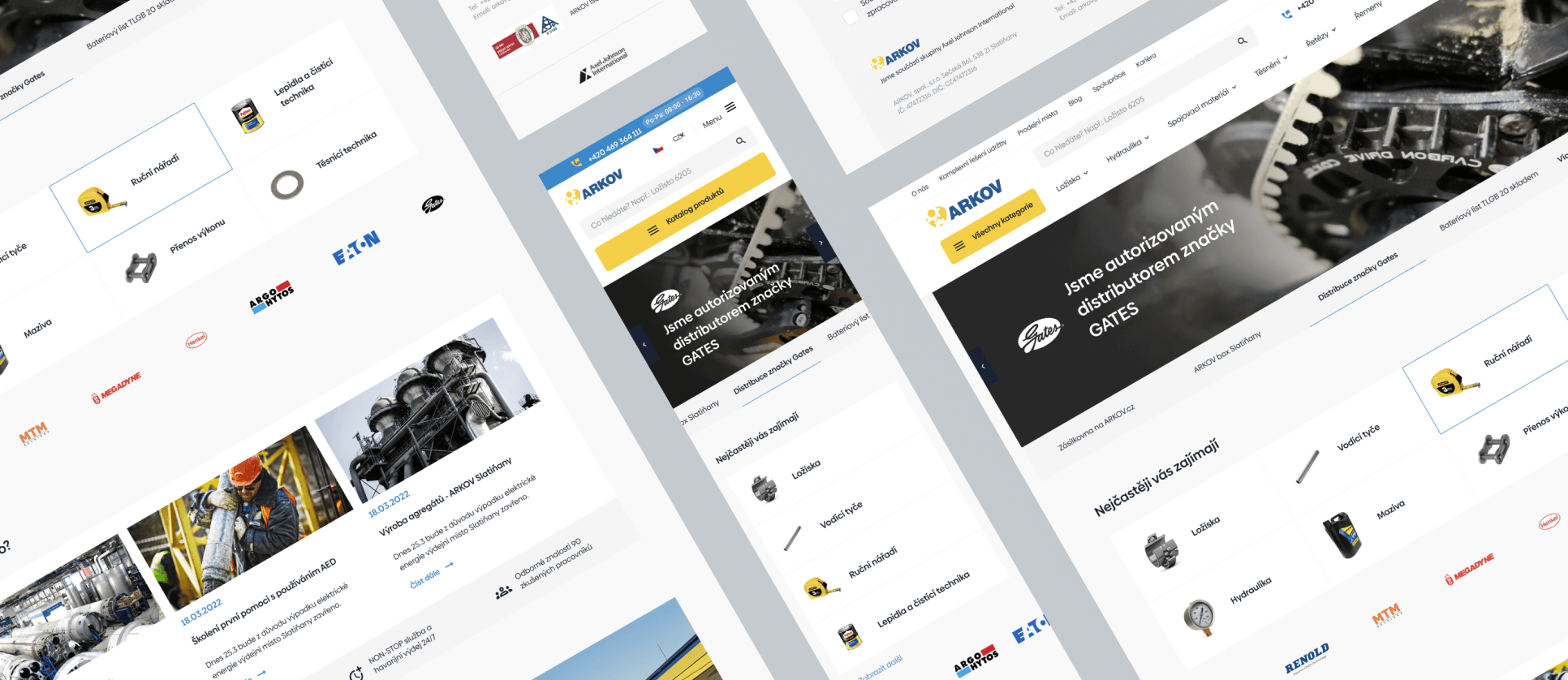
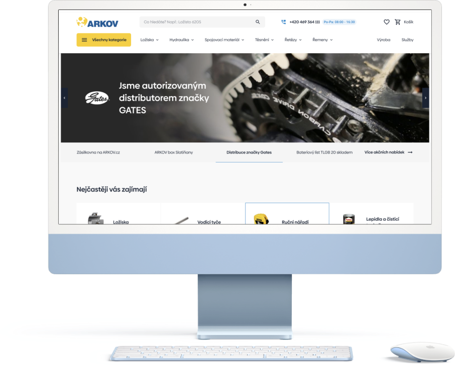
We approached the redesign of Arkov's website with empathy for a target audience that appears conservative and more focused on performance and responsiveness, and more resistant to trends and graphically rich and challenging visuals.
The focus of our work was therefore a fine-tuned UX focused on speed of search and filtering in a large calatogue and a comfortable and accelerated shopping process. Moreover, we created everything with respect to the Arkov.cz brand and the technologies used on the backend and frontend.
Colors
Along with the new website design, we modified the basic set of 4 colours. We increased saturation and fullness for a better impression, and higher contrast.
