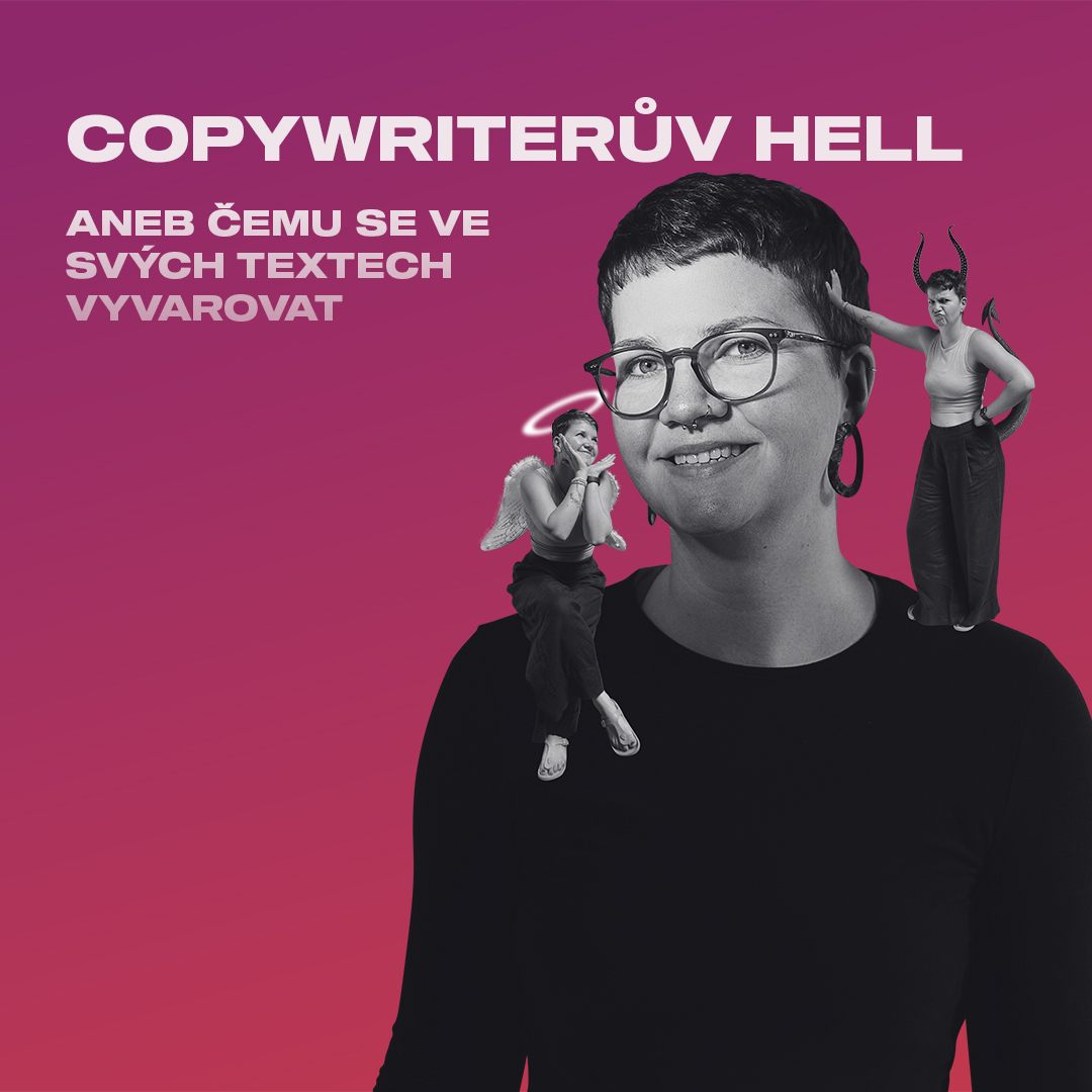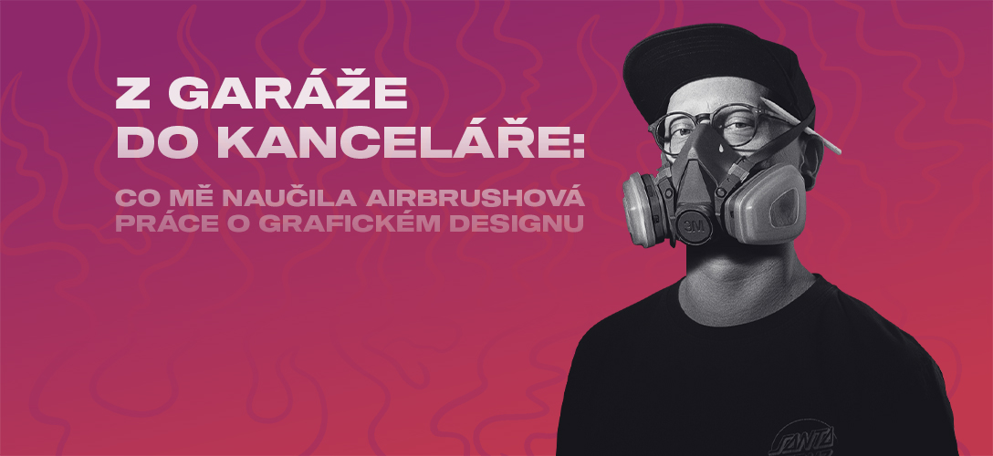
From garage to office: What airbrushing taught me about graphic design
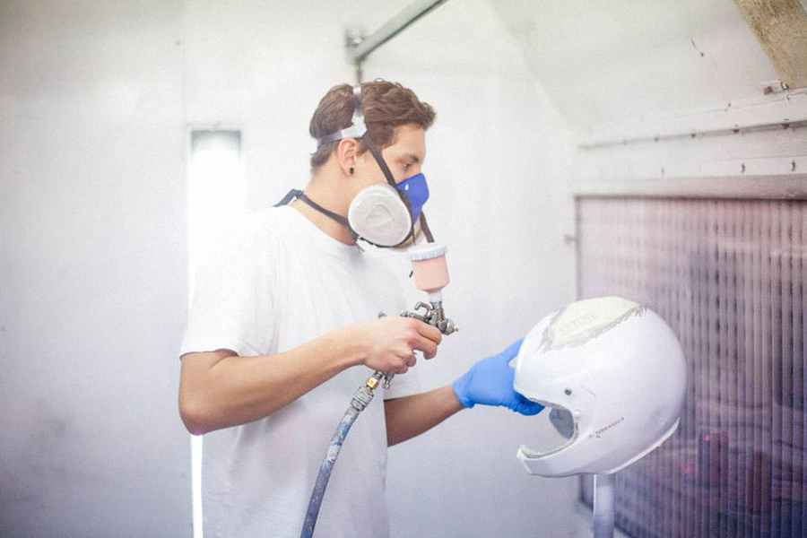
Before I sat down to my first agency brief and started designing layouts for clients, I was more likely to be holding an airbrush than a mouse. Instead of budgets and presentations, I was working on templates for carbon fiber bicycles, sanding motorcycle tanks, or discussing with my boss where to place the Red Bull logo on a helmet so that it would look good even at 200 km/h. I was airbrushing for the extreme world—a world of noise, speed, and adrenaline. And even though I now work in a creative agency where everything is smoother, many of the principles from that time have stayed with me. Maybe it's thanks to them that I create better designs today. This article is about what working in a garage taught me and why it comes in handy when I'm sitting at a computer in an agency.
Design that has to withstand something
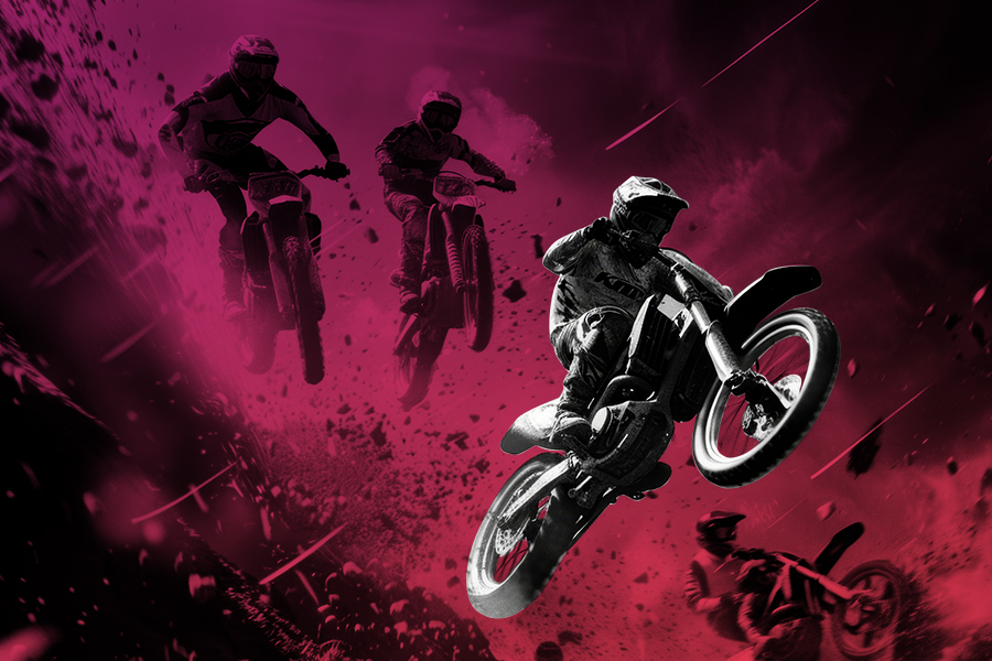
When you airbrush a motorcycle or helmet, it's not enough for it to look good in a photo. It has to look good even after the race, when the whole body is covered in mud, the helmet is scratched, and the hood is dented from the wind pressure. The design simply has to last, both physically and visually. When creating a banner or visual for social media, I think the same way: – Will it work in the feed among other ads? – Will it be overdone? – What will happen if someone crops it or drags it into a different format? Airbrushing taught me that visuals should not only be pretty, but also functional, clear, and should leave an impression even in challenging conditions. Only now, instead of mud and rain, I deal with algorithms and competitors' ads.
Every millimeter counts
With airbrushing, there is no room for error. There is no Ctrl+Z. Making a mistake often means sanding, repainting, and re-layering. And that hurts—in terms of time, money, and mental energy. It teaches you to think about every stroke in advance. I've carried this approach over into graphic design. When I'm laying out a visual, I'm not the type to "try and see how it turns out." I don't measure, test, or move things half a pixel until it works... Not because I'm not a stickler for detail, but because I know what a millimeter can do. I know that a slight shift means a different dynamic. That a slightly larger gap can disrupt the balance of the entire layout. Airbrushing taught me to respect space. Whether you're spraying flames on the side of a motorcycle or composing typography for a company banner, it's always the same thing: every millimeter counts.
The client is not an obstacle, but part of the project
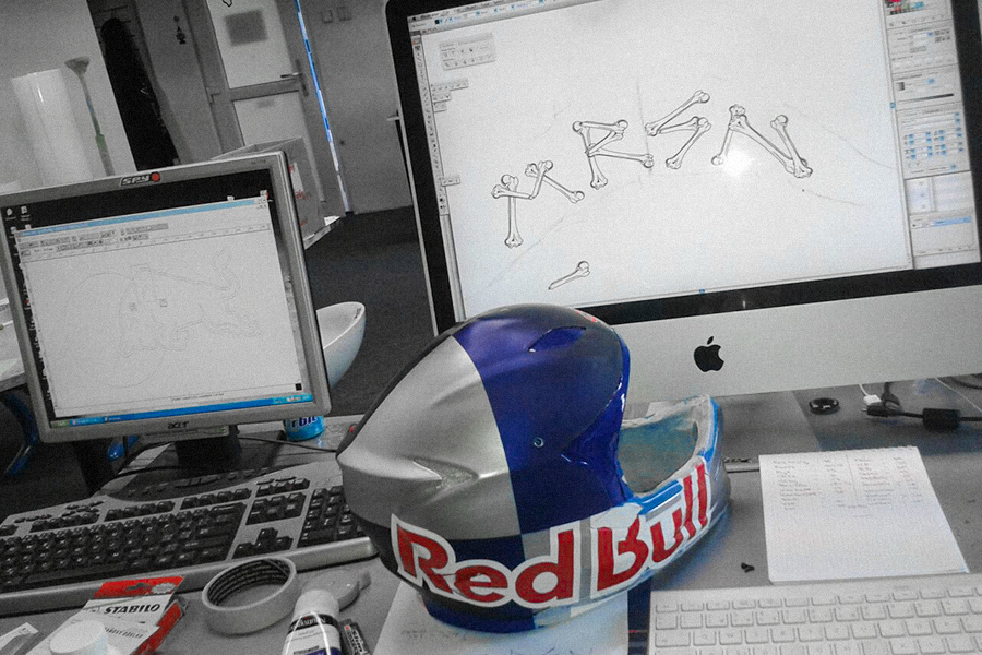
When I worked for brands such as Monster Energy and Red Bull under the wing of Petr "Šimi" Šimák from SlimGrafix, I had to respect clear rules—colors, logos, dimensions, brand tone. At the same time, however, these weren't just "orders." It was collaboration. When someone sits on a motorcycle and their helmet has a design from your workshop, suddenly how they feel while riding also matters. This still comes back to me today when I create visuals for clients at WeBetter. Instead of a racer, there is a brand manager or startup founder, but the principle is the same. It's not an enemy that limits your creativity. It's someone who has a story, a need, and expectations. And your job is to find a balance between what the brand wants and what you want to say as a graphic designer. Airbrush taught me to understand visual identity as trust. And that when you respect your client, you have a much better chance of creating something that makes sense.
Creator vs. machine: why you should leave your mark on every piece of work
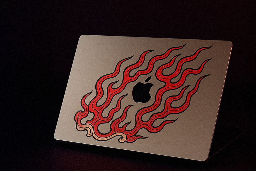
Airbrush is never completely perfect. And that's precisely what makes it so magical. Every stroke is original, every piece is unique. Even if you make two helmets with a similar motif, they will never be the same. And that reminds me to this day why I started doing graphics – not because of templates, but because of creation that has personality. Today, I move in a world where there is pressure for efficiency, automation, and a uniform visual style. And yet I believe that a good graphic designer should put a piece of themselves into every piece of work – whether it's an idea, a detail, a color, or a composition. Something that does more than just produce a functional output. Šimi taught me to be authentic, even when working on a commission. That's why I try to ensure that the result in the office reflects not only the brand, but also the person who created it.
From the garage to the office and back again
The journey from the garage to the office wasn't a leap, but a smooth transition. And even though I don't pull the hose from the compressor today, I still have that boy inside me who drew skulls on tanks and tried to hit the line around the screw. Design changes, but the approach remains the same. Whether you're designing a helmet for a Red Bull rider or visuals for a LinkedIn client, it's always about the same thing—understanding what needs to be created, why it needs to be created, and putting a piece of yourself into it. And if you're a graphic designer and you feel like you're lacking energy? Feel free to go back to the "garage." Where you started. Where you created because you enjoyed it. Maybe you'll find exactly what you're missing today.